Improving the Online Experience of Building Custom Skateboards.
TYPE :
Website feature
ROLE :
UI/UX designer
TEAM :
Solo project
Note: This is a fictional concept created to showcase my design process and skills. SkateHive is not a real brand.
This case study includes a second part that explores the site's navigation structure and visual identity.

An Introduction:
Skateboarders love customizing their setups — it’s a core part of the culture. Yet many struggle to find the right tools to bring their vision to life.
For SkateHive, I set out to design a custom board builder that delivers a more intuitive, engaging, and user-friendly experience.
The Problem & Insights:
While many skateboard stores offer “Build your own board” tools, the experience is often clunky and confusing, especially for beginners. As a result, users either abandon the process or settle for pre-built boards that don’t fully match their needs or style.
After interviewing five skateboarders (ages 17–28, beginner to mid-level) and auditing three builder tools (Skate warehouse builder, Tactics builder, and DGK builder) these key pain points stood out:
Incompatible parts can be combined with no warnings.
No full-board preview, making it hard to visualize builds.
Overwhelming and confusing interfaces.
Setups can't be saved, so progress is easily lost.
Limited personalization options.
Mapping the Journey:
I mapped a task flow to understand the full skateboard-building process and identify where users got stuck, hit friction, or dropped off. Combined with earlier insights from my tool audits, this uncovered additional issues:

Crafting the Interface:
I began by creating wireframes to define the builder’s layout. Then, I developed a style guide inspired by skate culture, using bold typography, a neutral palette, and a vibrant red accent to highlight key actions and reflect skating’s energy.
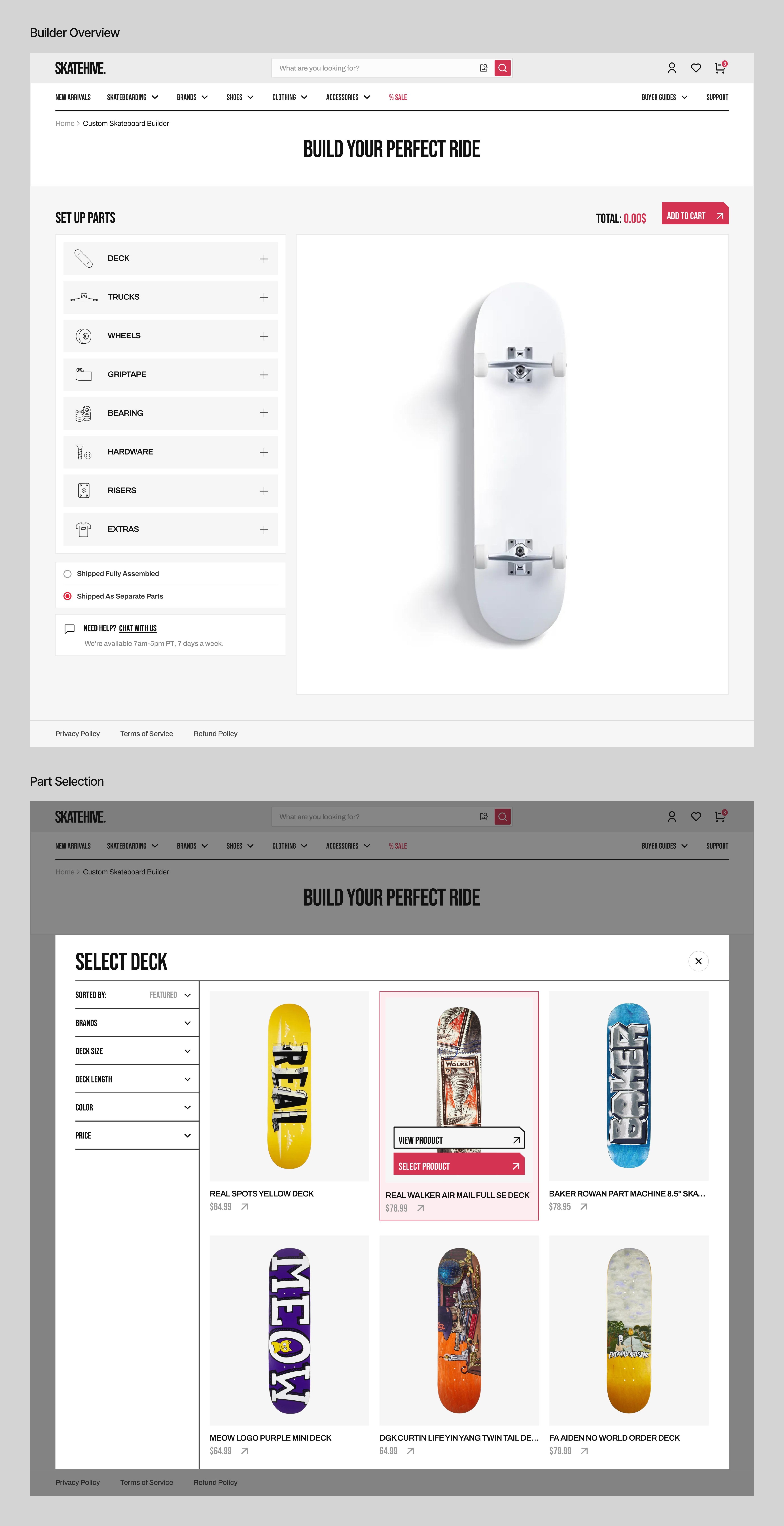
The final UI uses a card-based layout that presents each part with options to replace, remove, or customize after it’s selected. Part selection happens through overlays that appear when users click a part card, showing filters and product options without leaving the main screen.

Experience Enhancements:
To elevate the building experience, I added a few enhancements that guide, inform, and keep users moving forward.
1 - Smart Compatibility:
When a user selects a part, the system filters the remaining parts to show only compatible options. Users can toggle this off to browse all parts, with incompatible options clearly marked to maintain full control with helpful guidance.

2- Live 3D View:
Each selected part updates in real time in an interactive 3D view. Users can rotate and zoom to explore their build from all angles, making it easy to see what's selected and how it all fits together.

3- Real-Time Feedback:
Every user action triggers immediate feedback that confirms successful steps or flags issues like part incompatibility, keeping the experience smooth and informed.

4- Save Progress:
Registered users can save their builds and pick up where they left off.

Personalizing the Build:
Users can personalize key parts such as decks and grip tape by adding artwork, colors, or text, allowing them to create boards that match their unique style.

Testing & Feedback:
Since this was a conceptual project, I gathered feedback from a few skateboarders. Overall, the response was positive. They appreciated the clean layout and the "real-time 3D preview" feature the most.
A couple of key suggestions:
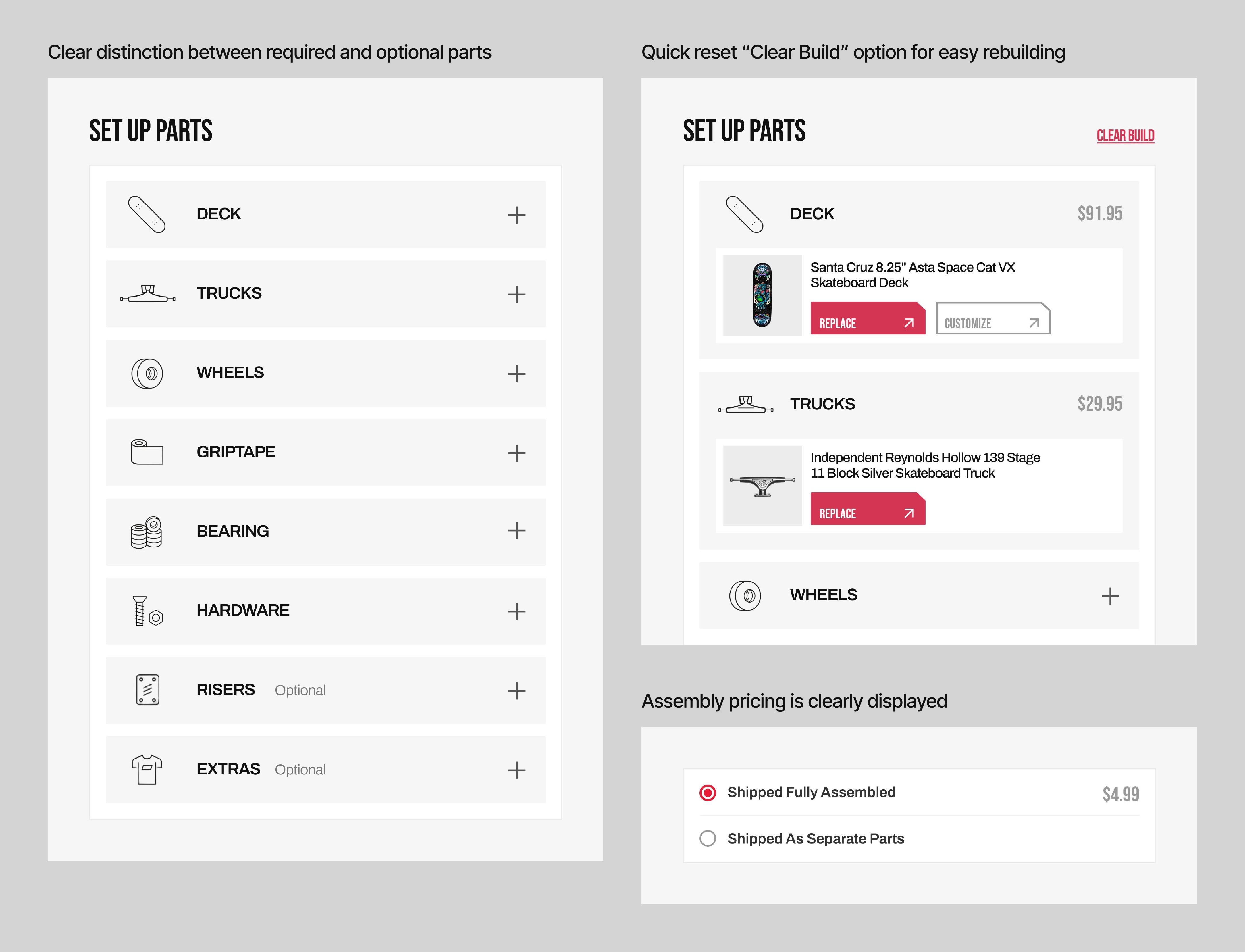
Clarify which parts are required to complete a build.
Add a “Reset” option to start over quickly.
Make the assembly option’s pricing clear (is it free or paid?).
Addressing User Feedback:
To address this, I labeled non-essential parts with a small “optional” tag to clarify which selections are required. I also added a “Clear Build” option to let users quickly start over, and made the assembly option’s cost clearly visible.

Takeaways:
No Bad Fonts, No Bad Colors, Just Bad Fits: Every visual choice, including fonts and colors, creates a feeling. The key is selecting elements that match the project and audience so the design feels right and communicates effectively.
Design the Rules Before the Screens: Establishing a style guide early ensures visual consistency and speeds up design decisions.
Challenges Faced:
The hardest part was finding skateboarders to interview. Many were busy or requested incentives I couldn’t provide for this concept project.
I’m grateful to the r/skateboarding subreddit, which helped me connect with a few skateboarders to interview and provide invaluable feedback on the final solutions.

