Simplifying Navigation and Refreshing Outdated Design in Skateboarding Ecommerce Sites.
TYPE :
eCommerce website
ROLE :
UI/UX Designer
TEAM :
Solo project
Note: This is a fictional concept created to showcase my design process and skills. SkateHive is not a real brand.
This case study includes a second part that explores the custom skateboard builder experience.

The Starting Point:
While researching skateboarding eCommerce sites, I noticed that most feel outdated and disconnected from the culture they represent. Skateboarding has energy, style, and attitude, yet these sites rarely capture that spirit.
For this educational project, I designed an online skate shop from the ground up, focusing on simplifying the information architecture and refreshing the visual design to better capture the spirit of skateboarding.
Defining the Focus:
After analyzing several skate eCommerce sites, I identified multiple common issues. For this project, I chose to focus on two key areas:
Confusing Navigation: Overwhelming menus and unclear labels bury key products under multiple layers of nested categories.
Generic Visual Design: Weak hierarchy and outdated styling fail to reflect skateboarding’s bold, energetic culture.
Fixing the Navigation:
I started by running an open card-sorting exercise with 10 participants to understand how users naturally group skate products. This helped identify which categories made sense, which overlapped, and which needed renaming to match common skate terminology.
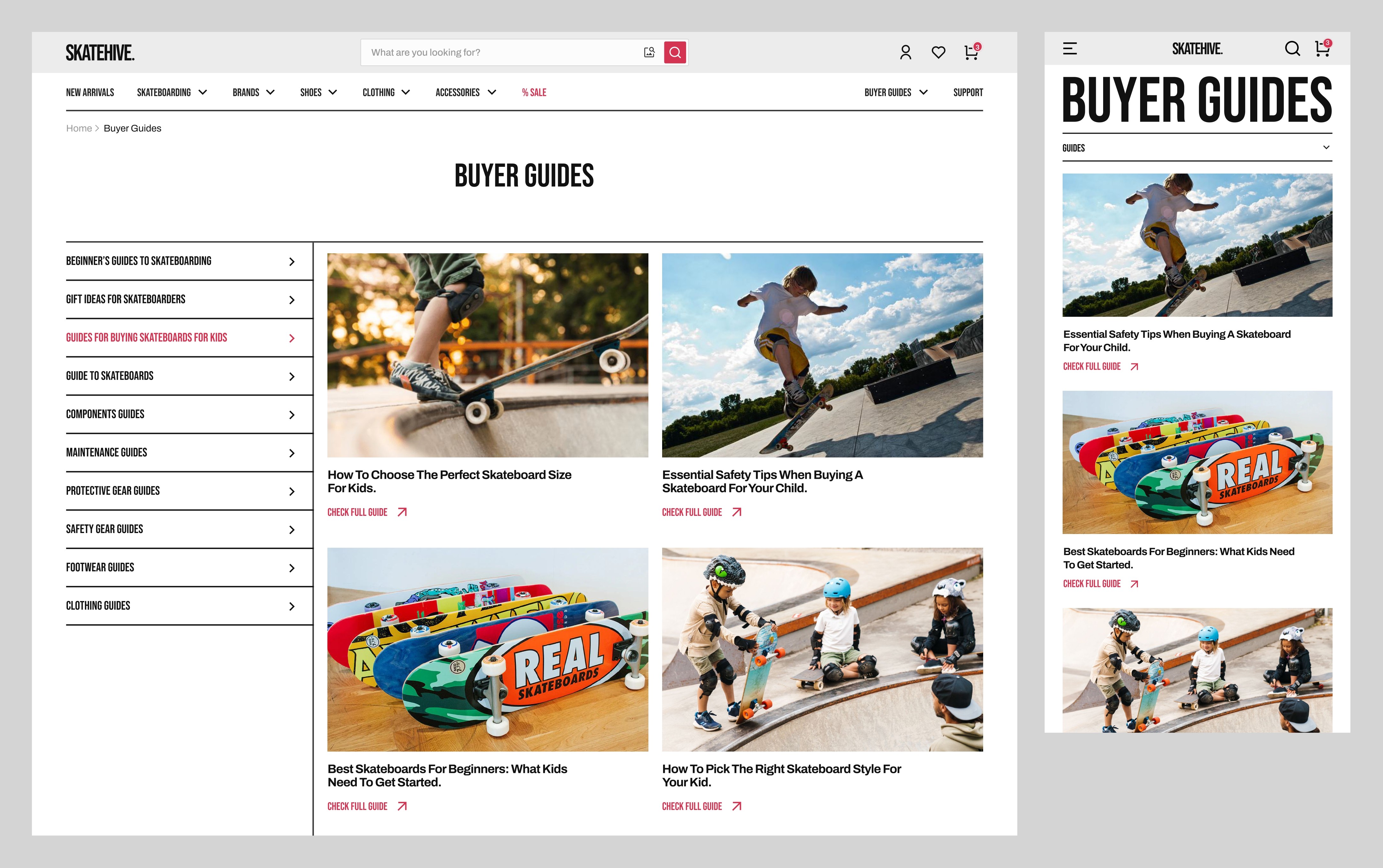
Using these insights, I organized the site into 8 clear categories. Product sections (Skate, Shoes, Clothing, Accessories) focus on gear types, while sections like Brands, Buyer Guides, and Sale provide alternative ways for users to discover and shop for products.

With the structure defined, I designed the final navigation, organized and easy to scan.

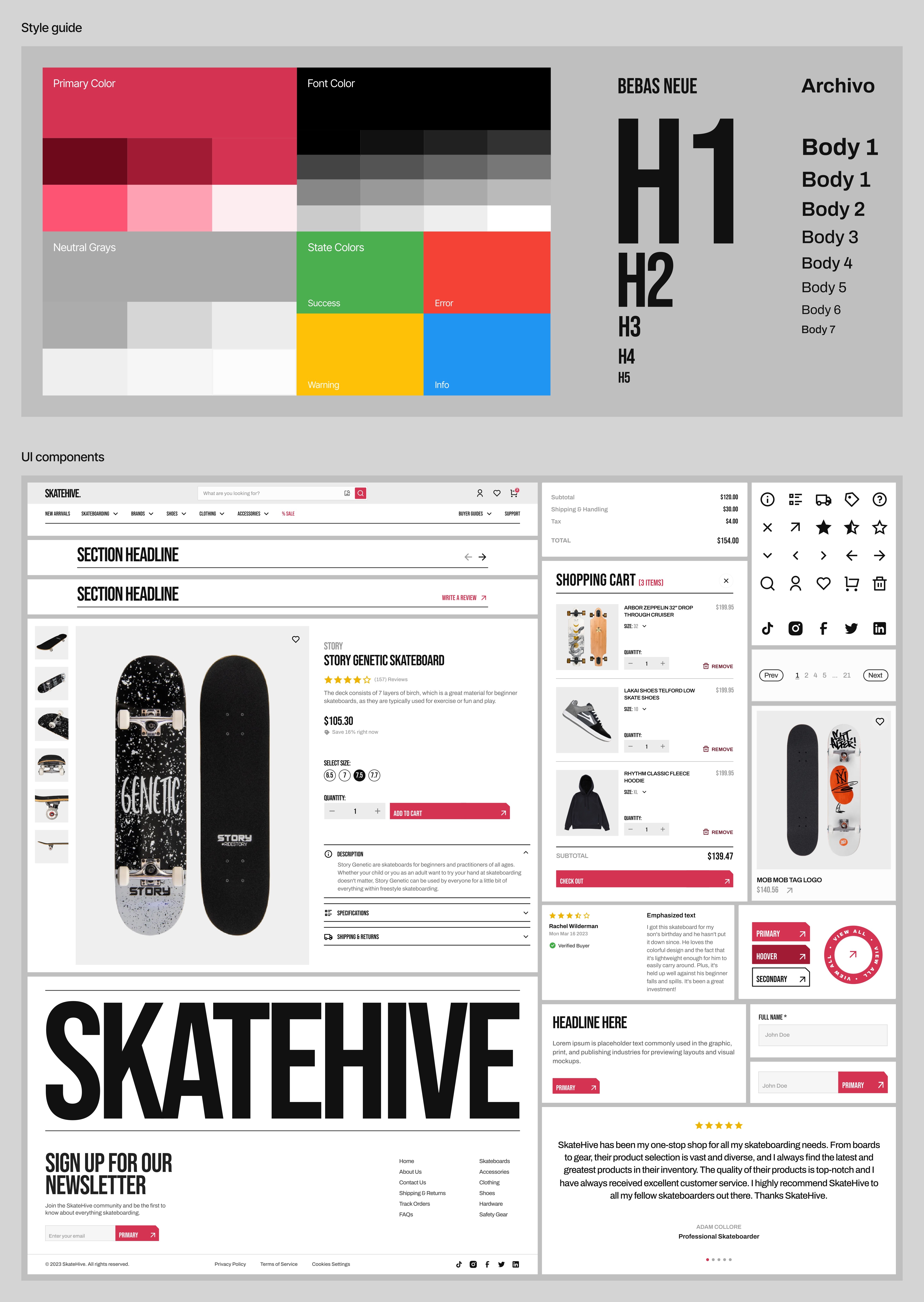
Refreshing the Visual Design:
To give the site a more modern, skate-inspired look, I developed a visual system rooted in skateboarding’s bold, graphic style.
For headlines, I chose Bebas Neue, a condensed, high-impact font that feels strong and energetic. Body text uses Archivo to maintain readability and a modern tone.
The color palette uses a strong red for buttons and key actions, paired with neutral grays to let product images stand out. Layouts rely on clear hierarchy, generous spacing, and consistent card designs to make browsing easy and visually organized.
Final UI Screens
Homepage

Catalog

Shopping Cart

Product Page

Checkout

Buyer Guides
About Us

Reflections:
This project gave me the chance to practice card sorting for the first time. Preparing for it took longer than expected. Skateboarding’s product catalog includes many categories and subcategories, and most card sorting tools were either too expensive or limited to 20 cards in their free versions; as a result, I ended up using FigJam.
I learned a lot about how users naturally organize information and how valuable that insight is when designing navigation systems.

